
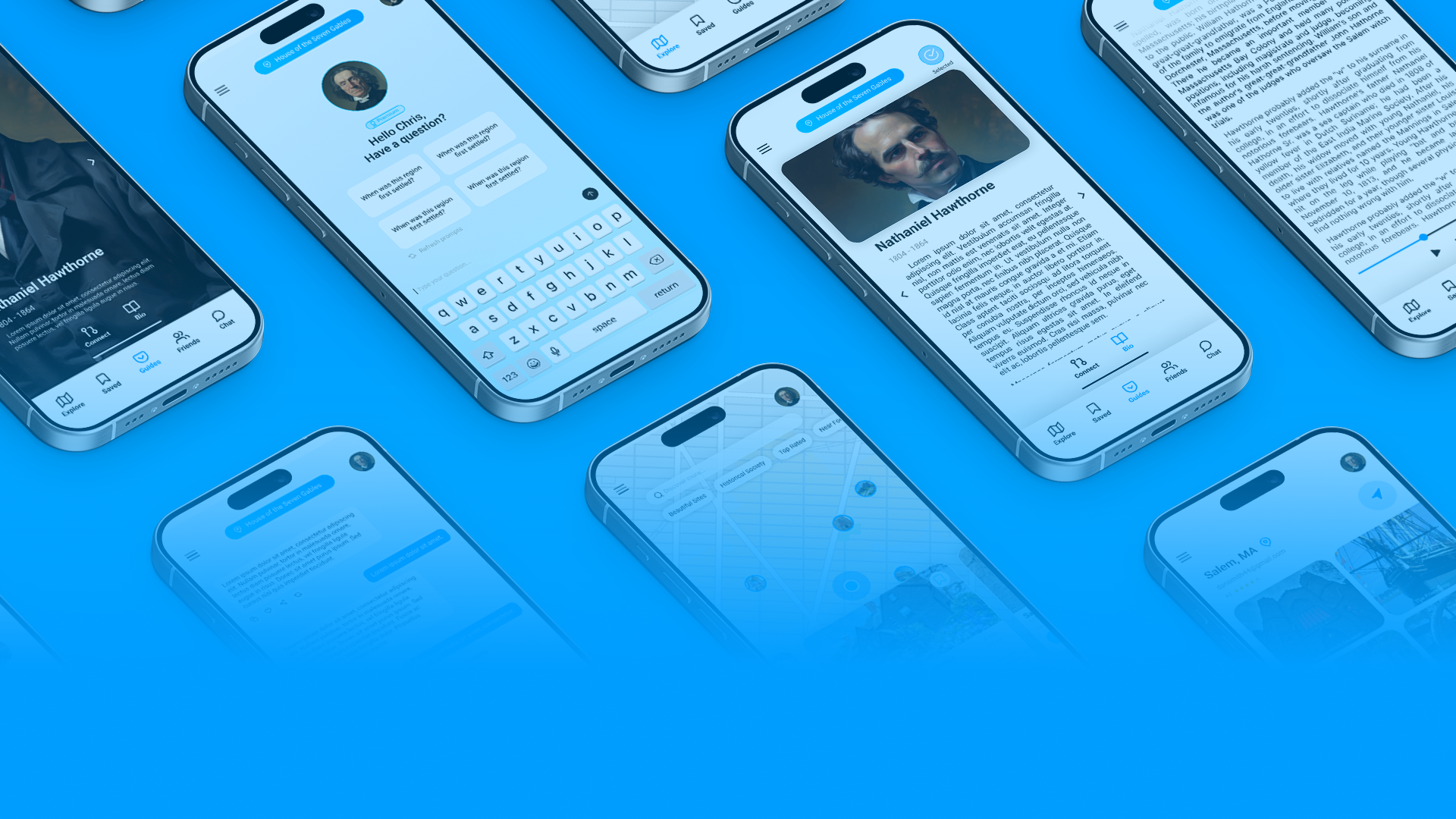

A geofenced tour guide app where history's most compelling figures narrate the world around you - as they lived it.

Role
Product Designer

Type
Concept

Platform
Android + iOS Mobile
01 Context
Audio tour apps have always had an intimacy problem. The voices are generic, the delivery is flat, and the presence of a human guide (the thing that makes physical tours memorable) is absent.
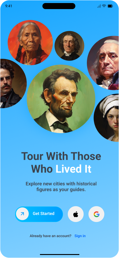
Histouric started as a question: what if historical tours were lead by those who lived it?
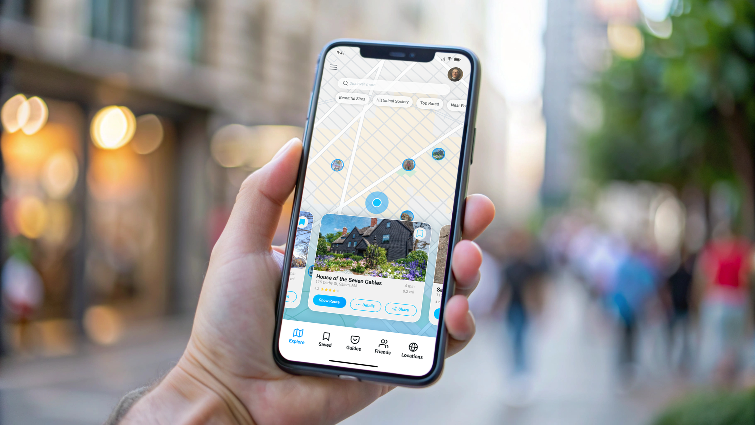
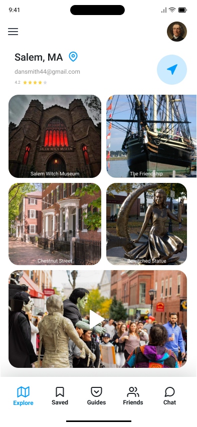
The concept pairs geofencing with agentic AI so that each location surfaces historical information with the relevant voice. At a Revolutionary War site in Boston, you might hear from a solider who was there. Visiting a jazz club neighborhood in New Orleans, a musician from that era walks you through what it sounded like. The guide matches the ground you're standing on.
The brief called for a system that could handle location-aware narration, collectible guide personas, and multi-route trip planning - inside a mobile experience that didn't feel like a glorified museum pamphlet.
02 Problems to Solve

Location-Gated Events
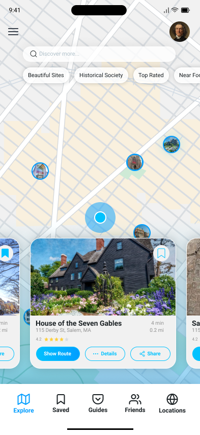
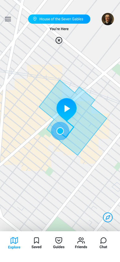
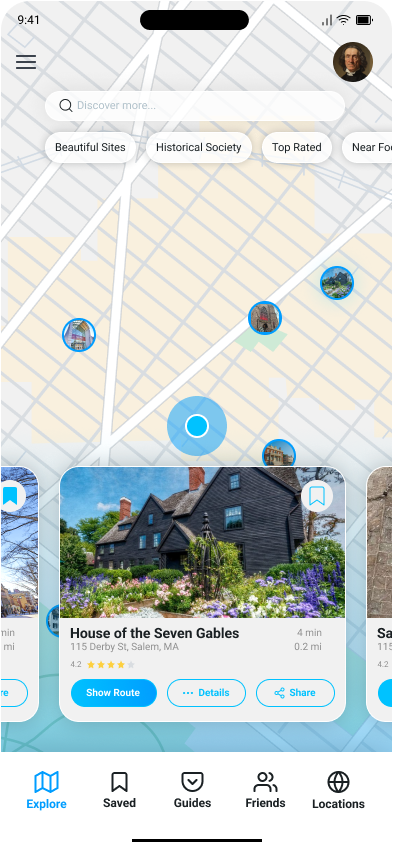
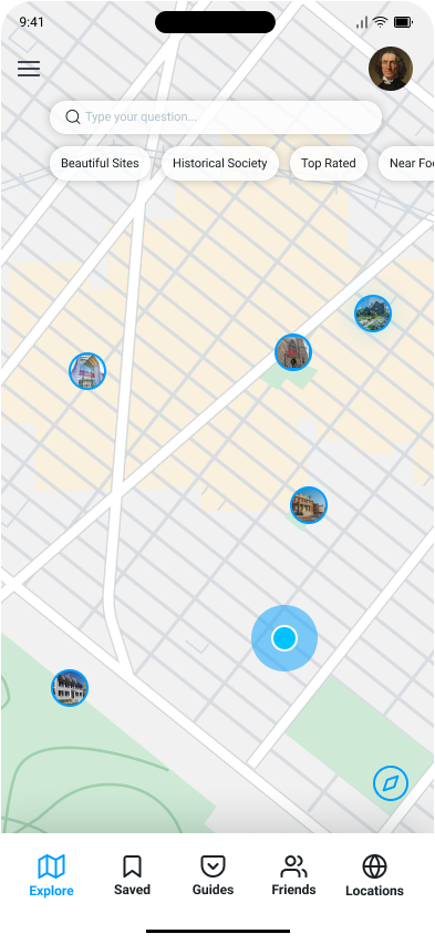
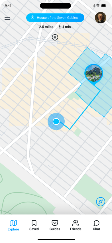
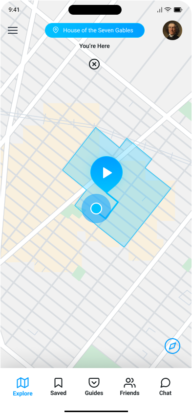
The map had to communicate active zones, point-of-interest hierarchy, and optimal routing - without drowning in pins and labels. Differentiation between site types and route variations had to be legible at a glance.

Guide Collection System
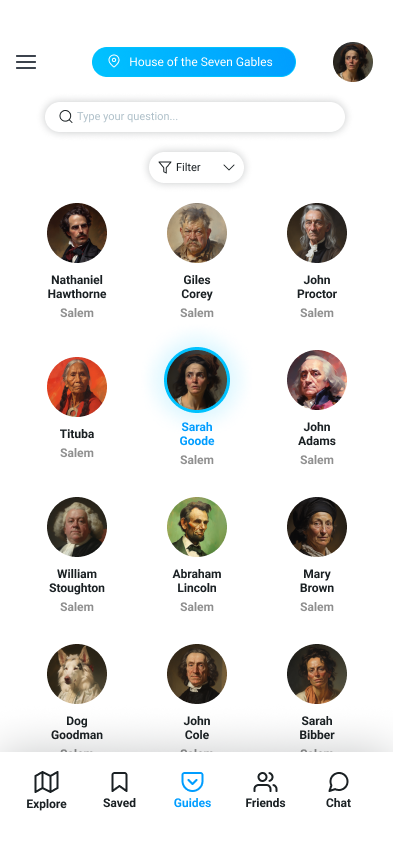
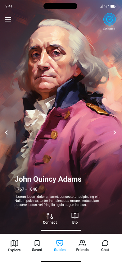
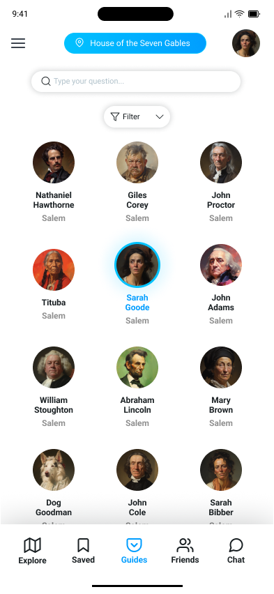
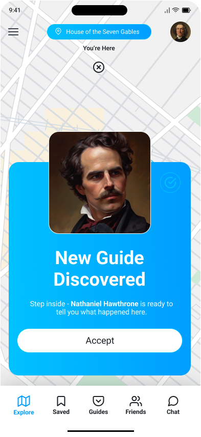
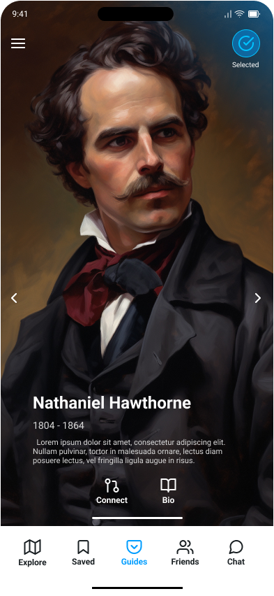
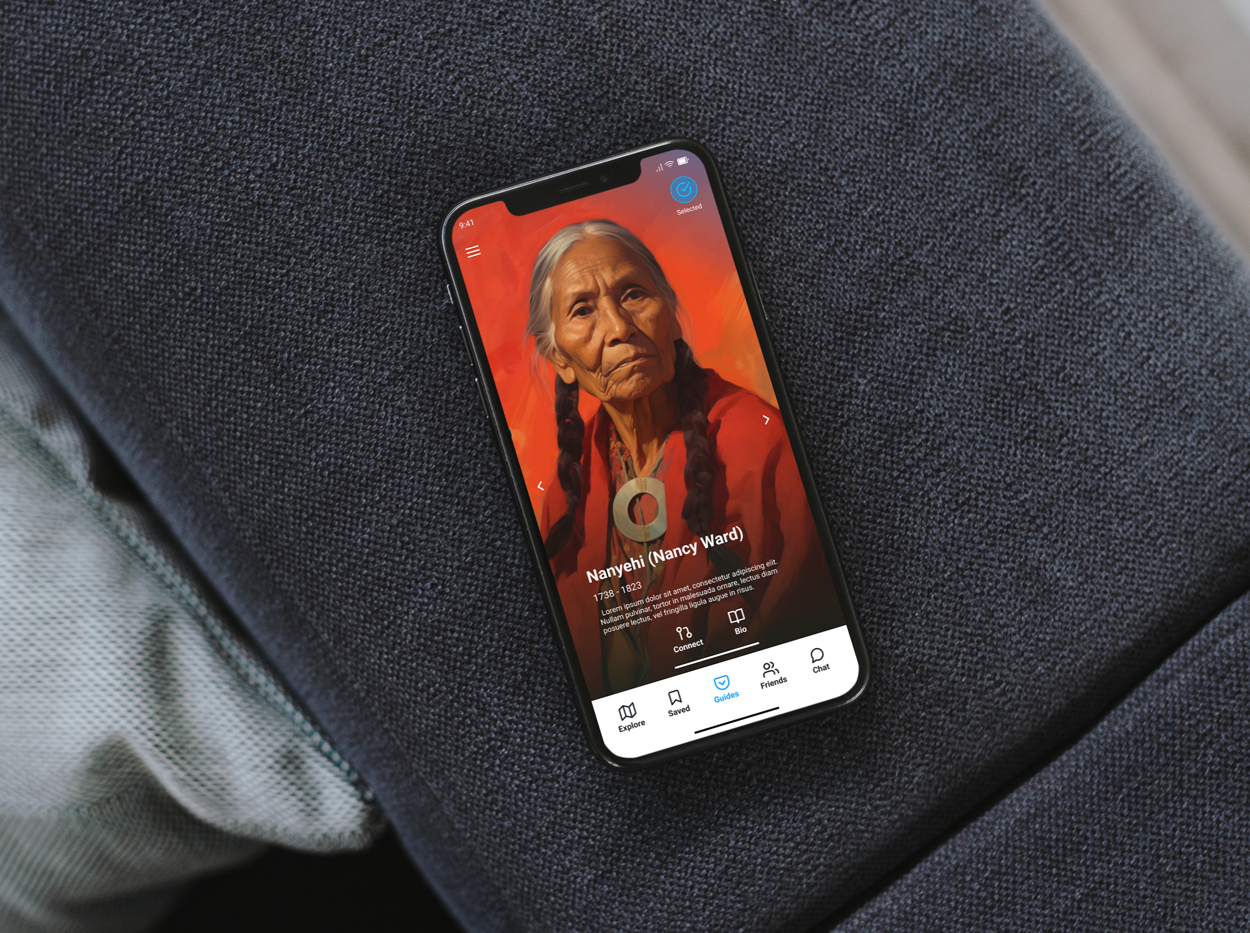
Guides unlock only when you physically visit their geofenced location. That mechanic needed a UI that communicated discovery, rarity, and anticipation - closer to a collectible card system than a settings menu.

Agent Integration
Guides unlock only when you physically visit their geofenced location. That mechanic needed a UI that communicated discovery, rarity, and anticipation - closer to a collectible card system than a settings menu.
03 Key Features
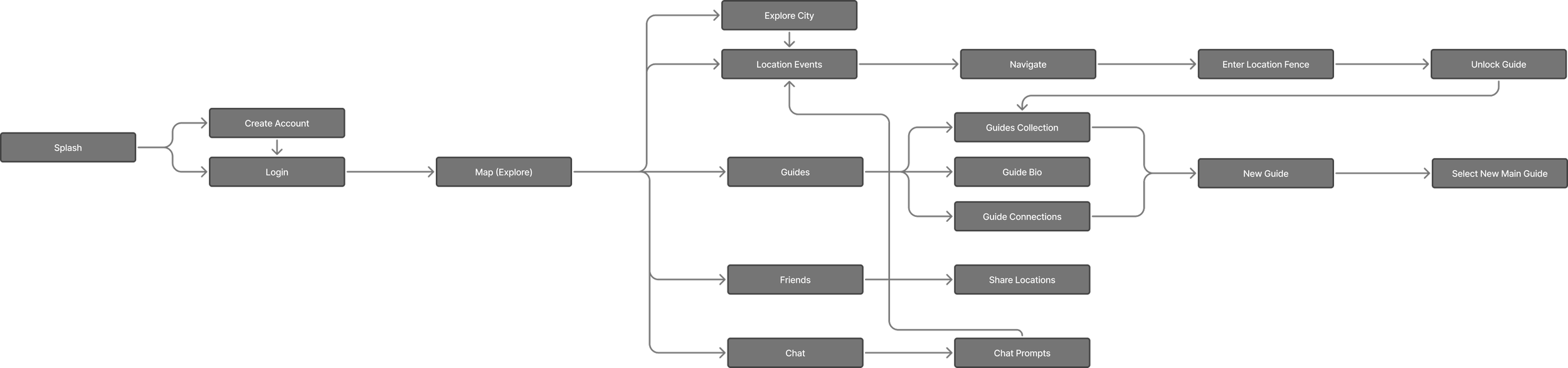
Every feature in Histouric exists to serve either the core loop - arrive, listen, unlock - or the extended engagement that keeps users returning between trips.
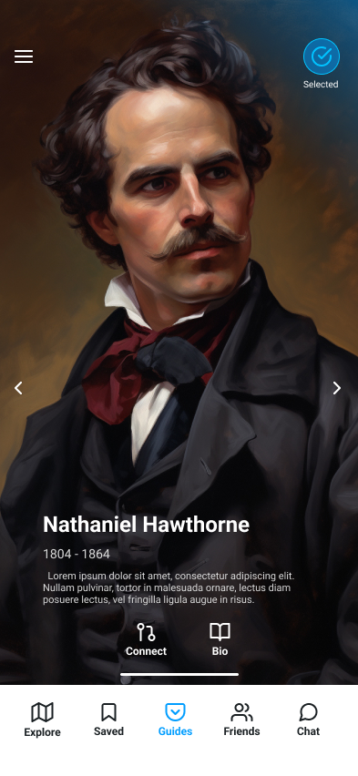
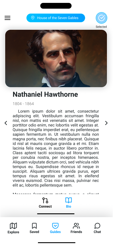
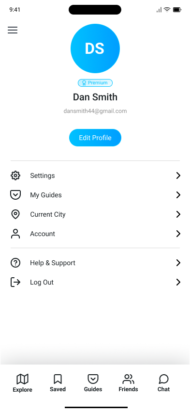
Users travel with a persistent main guide of their choosing. At geofenced sites, a contextual figure can take over narration temporarily - or the user can keep their main guide. The handoff is opt-in, not automatic.
Guide Selection & Usage
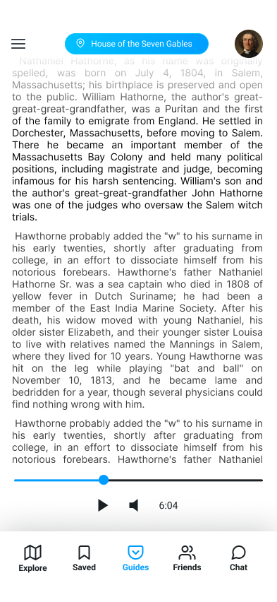
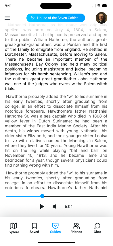
Audio-first, but not audio-only. Users can read along or follow text transcripts - useful in loud environments, accessibility contexts, or when users want to move faster than audio allows.
Event Narration
Entry into a zone triggers an unlock event - a short contextual prompt and the option to hear from that location's associated guide. Zones vary in size based on site significance, not just geography.
Geofencing & Location Events
Routes surface based on stated interests - architecture, food history, conflict, culture - and adapt dynamically based on time constraints and previously visited sites. The system builds toward the user, not at them.
Route Planning
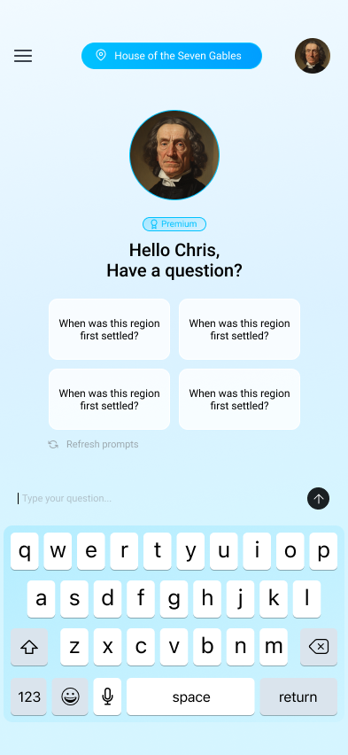
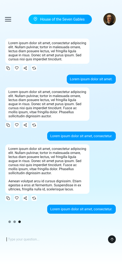
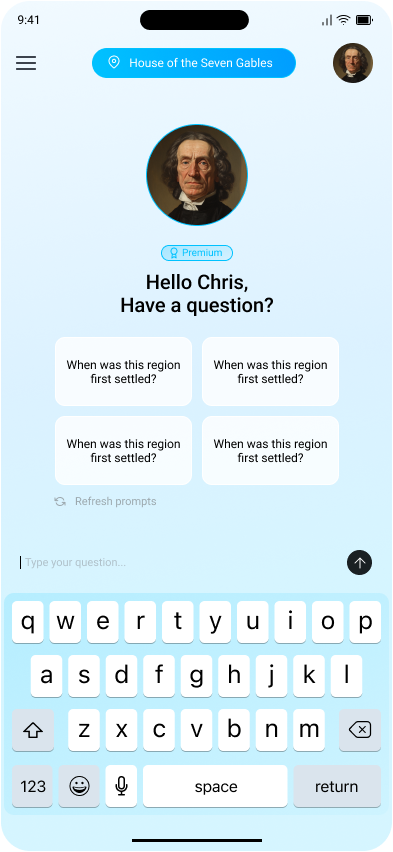
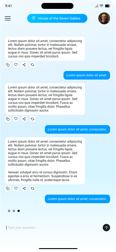
Between sites, users can converse with their main guide in character. The AI maintains a consistent voice and perspective - not a chatbot, but a companion with a point of view shaped by their era and expertise.
Guide Chat
Wireframes




Guides
Navigation




Chat
Reader
04 Design Principles
Paper White
With a vision for building something meaningful, our founder brings a blend of big-picture thinking and hands-on experience. They set the tone for everything we do.
Content Forward
Focused, approachable, and driven by results, our sales manager is all about building strong relationships. They help connect people to the right solutions - with clarity and care.
Guide Anchor
Creative and strategic in equal measure, our marketing director brings fresh ideas to every campaign. They turn insights into action and help our message resonate with the right audience.
Typography



Roboto carries the headers. Its geometric warmth reads well at display sizes without feeling clinical, which matters when the content is historical figures. Inter handles body copy and monospace contexts, keeping location information and guide bios scannable on a moving device. Two typefaces with genuine screen-optimization pedigree that don't compete with the character art and map.
Color Usage

Primary Blue
#009DFF

Highlight
#00C2FF

Text Black
#1A2023

Paper White
#FFFFF
A primary blue anchors navigation and main event elements, giving the interface a clear action hierarchy without competing with the character art. A secondary highlight blue surfaces in specific contextual moments like active states, selected guides, and zone indicators, creating a distinction between ambient UI and live interaction. Near-black text against a paper white background keeps the reading experience warm rather than stark, and the same paper white bleeds into fades and gradients that soften transitions between the map and content layers.
05 Screens
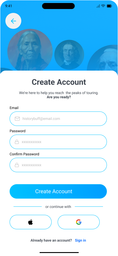
Here, creativity meets opportunity. Whatever you're building, we're here to help you take the first step with confidence. Driven by curiosity and built on purpose, this is where bold thinking meets thoughtful execution. Let’s create something meaningful together.
05 Reflections
Designing for AI that has a character
Most AI product design work I'd done before was about surfaces - inputs, outputs, loading states. Histouric forced me to think about personality as a design material. A guide's voice, consistency, and perspective had to feel authored rather than generated. That meant designing not just the chat interface, but the constraints on the AI itself - what it could and couldn't say, how it handled questions outside its era.
The collection mechanic's emotional weight
Unlock systems in games work because they make the user feel like they earned something. Translating that to a tour app meant the unlock had to feel like a discovery, not a reward for proximity. I spent more time on the zone-entry moment - the animation, the reveal — than on almost any other interaction in the app. That investment showed.
Map design as information hierarchy, not cartography
The map wasn't a map. It was a decision surface. Users were making real-time choices about where to go, what to prioritize, and which route matched their available time. That reframe changed everything about how I differentiated zone states, route types, and point-of-interest density. Clarity of hierarchy mattered more than visual fidelity to actual geography.
What I'd do differently
The route planning feature ended up more complex than the problem warranted at this stage. In hindsight, a simpler v1 — three preset route archetypes rather than full interest-based customization — would have let me spend more time on the guide chat experience, which is where the product's real differentiation lives. I'd tighten the scope earlier next time.