
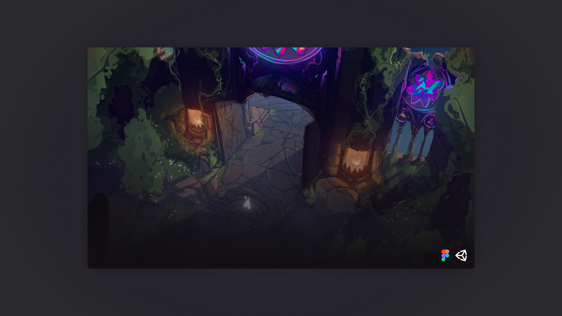

Bullet-heaven combat is visual chaos by design. Dozens of projectiles, enemies, and ability effects fill the screen simultaneously, and the interface has to live inside all of that without competing with it. The design challenge on Lighteater was not how to make the UI look good in isolation. It was how to make it disappear when the player needed it to, and become legible in under three seconds when they needed to make a decision.

Role
Product Designer

Type
Production

Platform
Unity / PC
01 Context
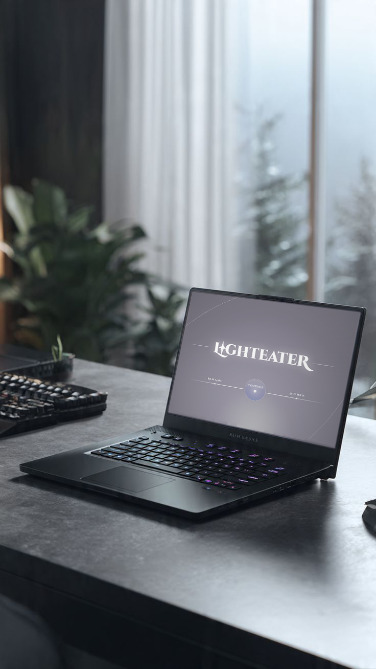
The brief was to design a full UI system for a live Unity build - HUD, menus, progression tree, upgrade screens - that could carry unlocks, upgrades, and a virtue-based progression system, all while reading as part of the game's world rather than a layer placed on top of it.
Bullet-heaven combat is visual chaos by design. Dozens of projectiles, enemies, and ability effects fill the screen simultaneously, and the interface has to live inside all of that without competing with it. The design challenge on Lighteater was not how to make the UI look good in isolation. It was how to make it disappear when the player needed it to, and become legible in under three seconds when they needed to make a decision
Lighteater is a game about light and its absence. The setting is a vast forest cathedral where stained glass windows cast colored light across the ground and that light is a mechanic. Standing in it does something. Avoiding it costs something.
When color and light are central to how the game is played, the UI can't be neutral about them. Every interface element had to participate in the visual language of the world: the refracted color, the fine tracery of leaded glass, the weight of stone and the delicacy of candlelight.
02 Mechanics Informing Design
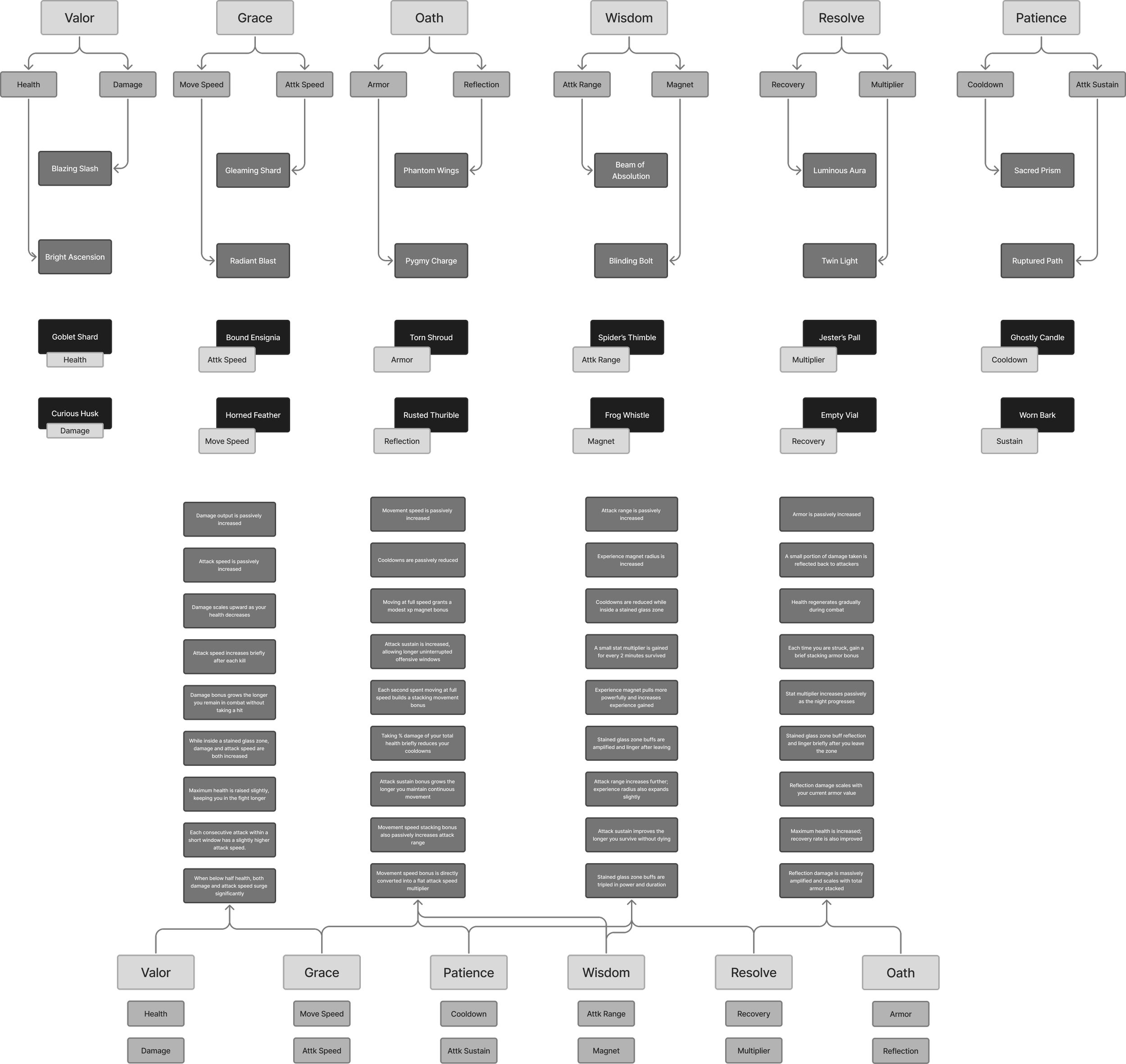
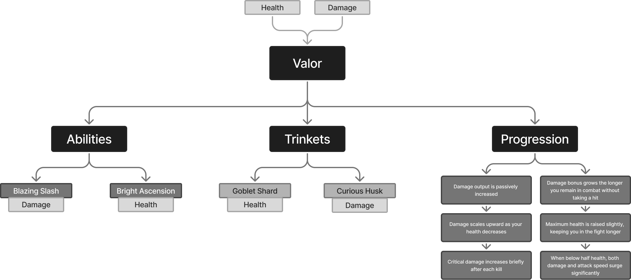
Each of the seven nights corresponds to a sin the enemy embodies. Defeating each boss collects that night's light and pushes back one more piece of the dark. But the player's progression is framed through the opposing Virtues — the qualities the moth must cultivate to endure the night. These are the upgrade categories wrapped in lore, the ability groupings and a semantic structure that defines the entire progression system.
Power + aggression
Valor
Grace
Movement + evasion
Oath
Buffs + protection






Patience
Wisdom
XP + Abilities
Resolve
Endurance + health
Recovery + speed
Virtue Ability & Progression Mapping
02 Problems to Solve

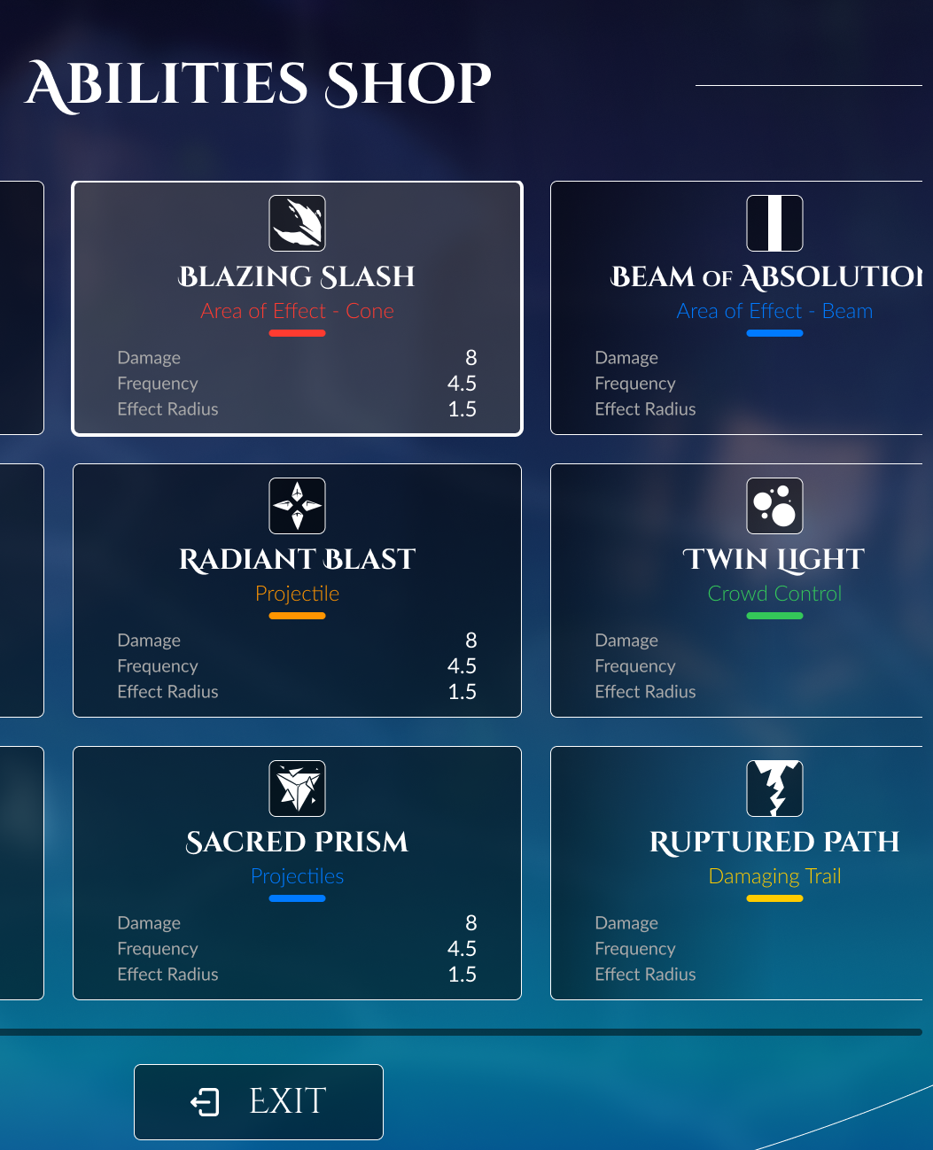
Reading Under Pressure
Decision screens appear mid-run when the player's attention is still on combat. The UI had to deliver enough information for a meaningful choice in under three seconds, without requiring the player to slow down and read carefully.

Consistency Across Object Types
Abilities, trinkets, and progression nodes are structurally different objects. Designing custom layouts for each would have created visual noise and made the system harder to build. A shared card anatomy had to work for all of them.

World Belonging
The game's visual world is specific: stained glass, candlelight, cathedral stone. A generic dark UI would have felt like an overlay. The interface had to feel like it grew out of the same materials as the environment.
Every feature in Lighteater exists to serve either the moment of combat or the moment of choice. The design had to hold both without letting either compromise the other.
03 Key Features
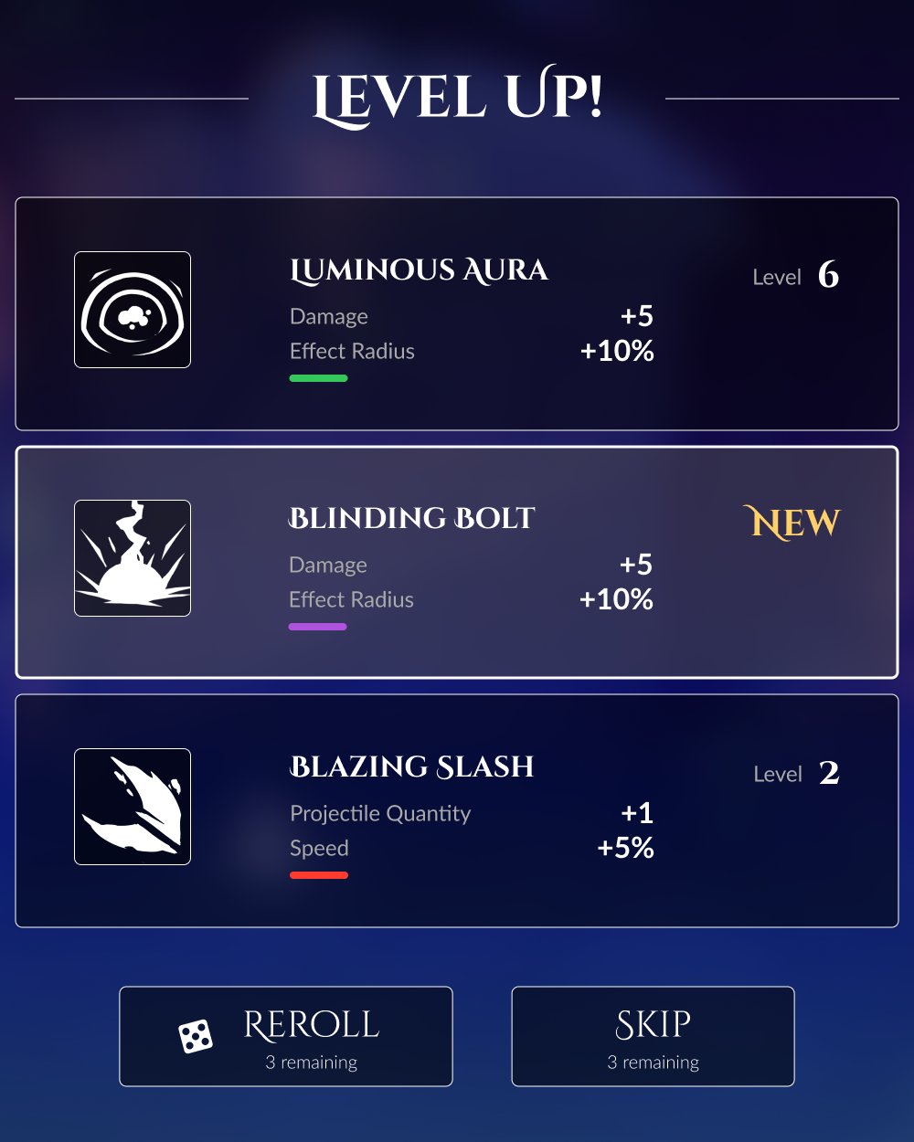
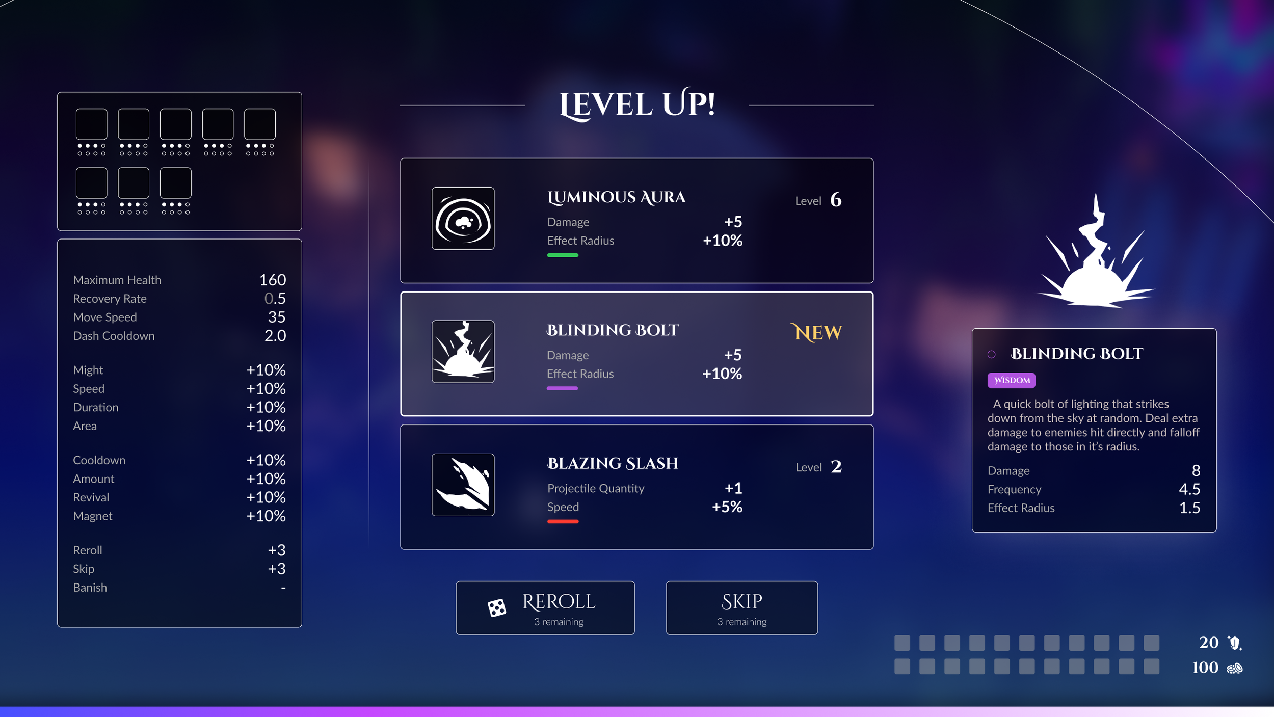
Level-up screens in roguelites are a moment of power and decision but they're also an interruption. The design challenge was making them feel ceremonial without making them slow. The solution was a compact card-based layout that presents all three upgrade options simultaneously, with virtue-colored headers that let players identify their choice by color before reading the text. The screen opens and closes in a single smooth transition — no pagination, no sub-menus, no confirmation dialog. You choose, you return. The world doesn't wait.
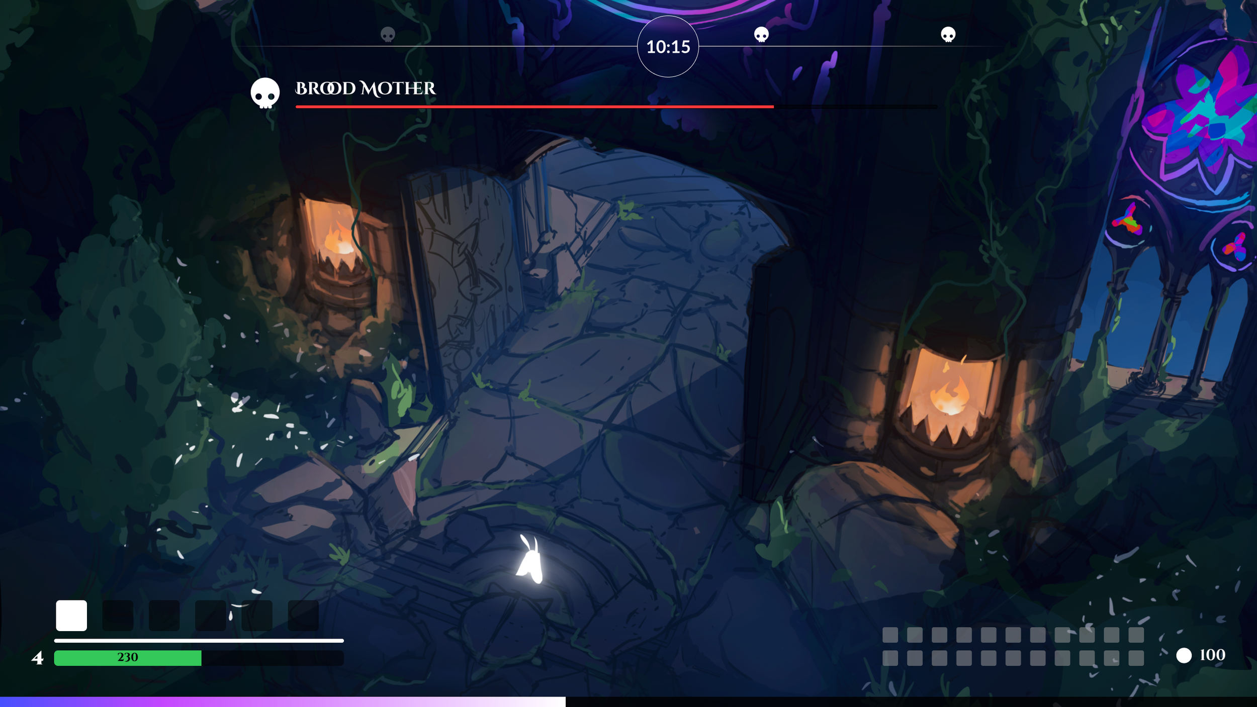
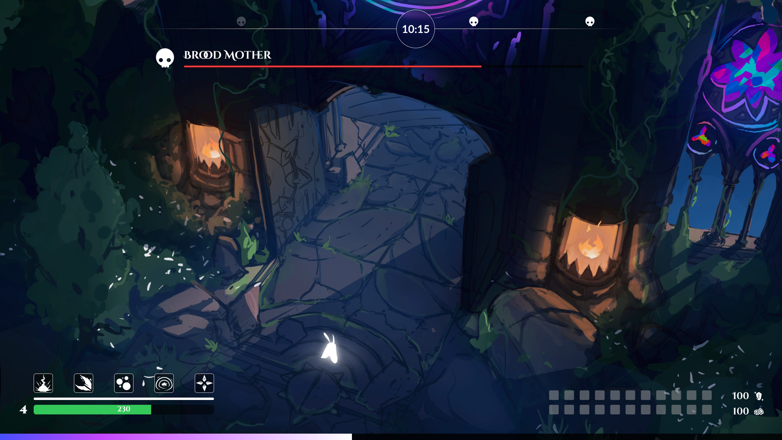
Night Cycle HUD
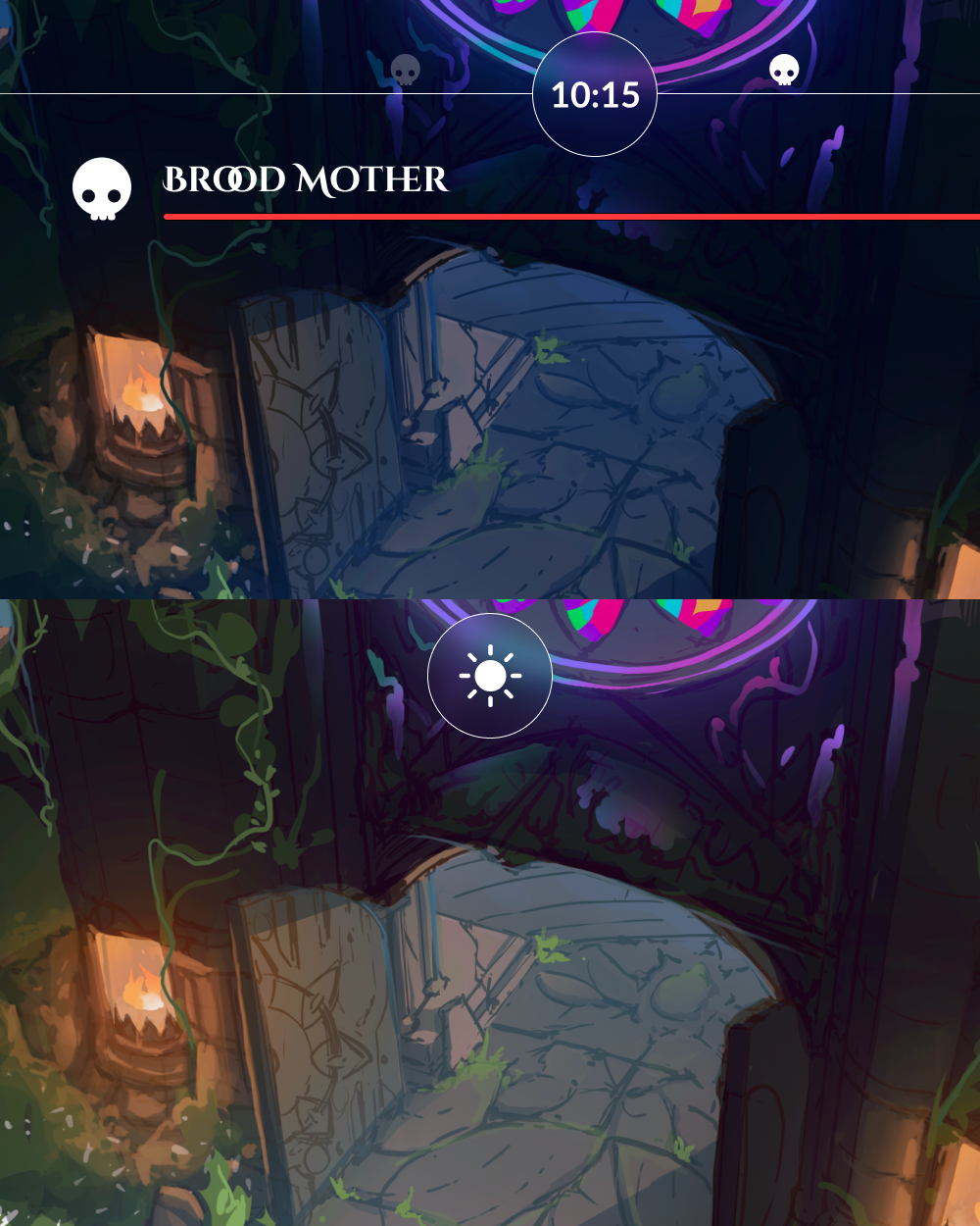
Player Info HUD
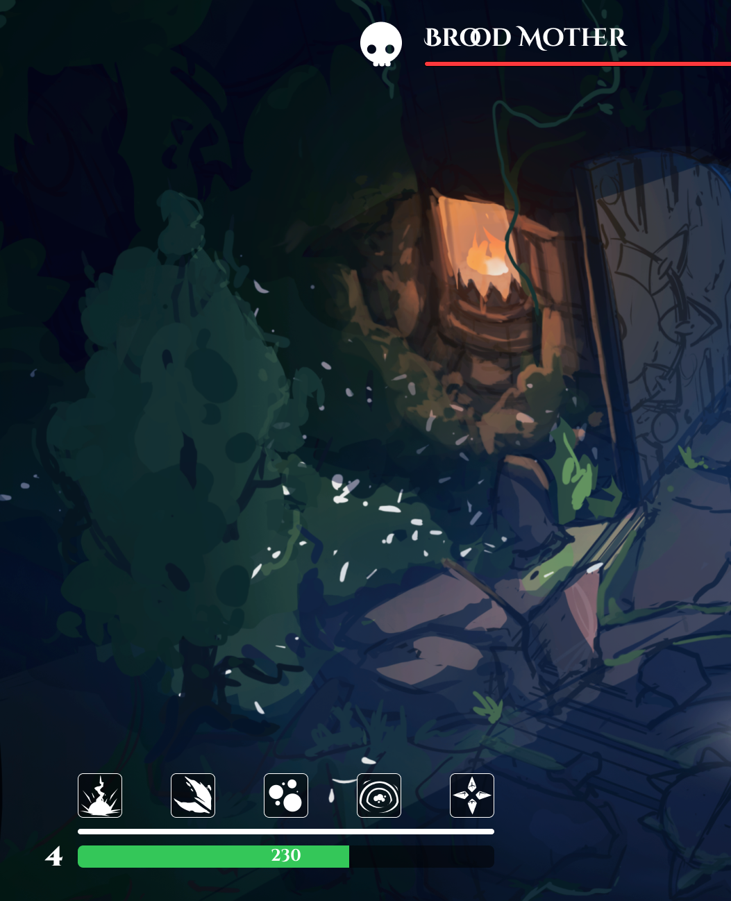
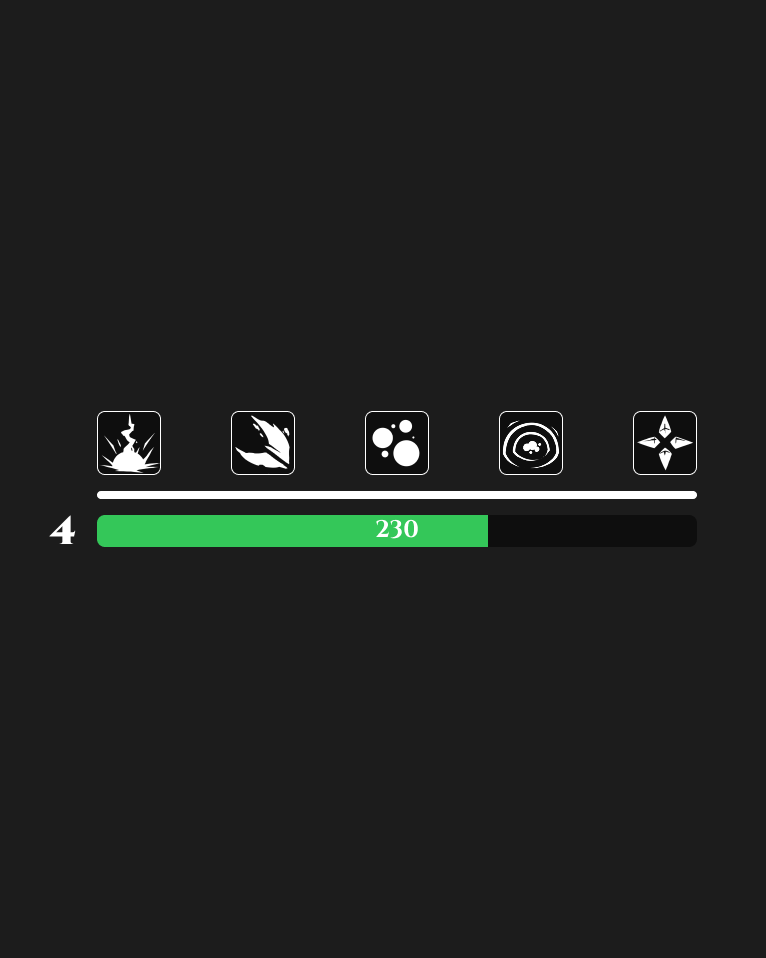
The HUD lives at the edges, communicates through thin lines and muted light, and disappears entirely when the player is in full health and not casting. It expands only when it needs to - a cooldown ring that materializes on use, a health arc that pulses only when low, a light meter that brightens only as it depletes. The design principle was: if the player is doing well, they shouldn't see the HUD at all. The UI should feel like the cathedral itself is whispering - not like a dashboard overlay on a gothic painting.
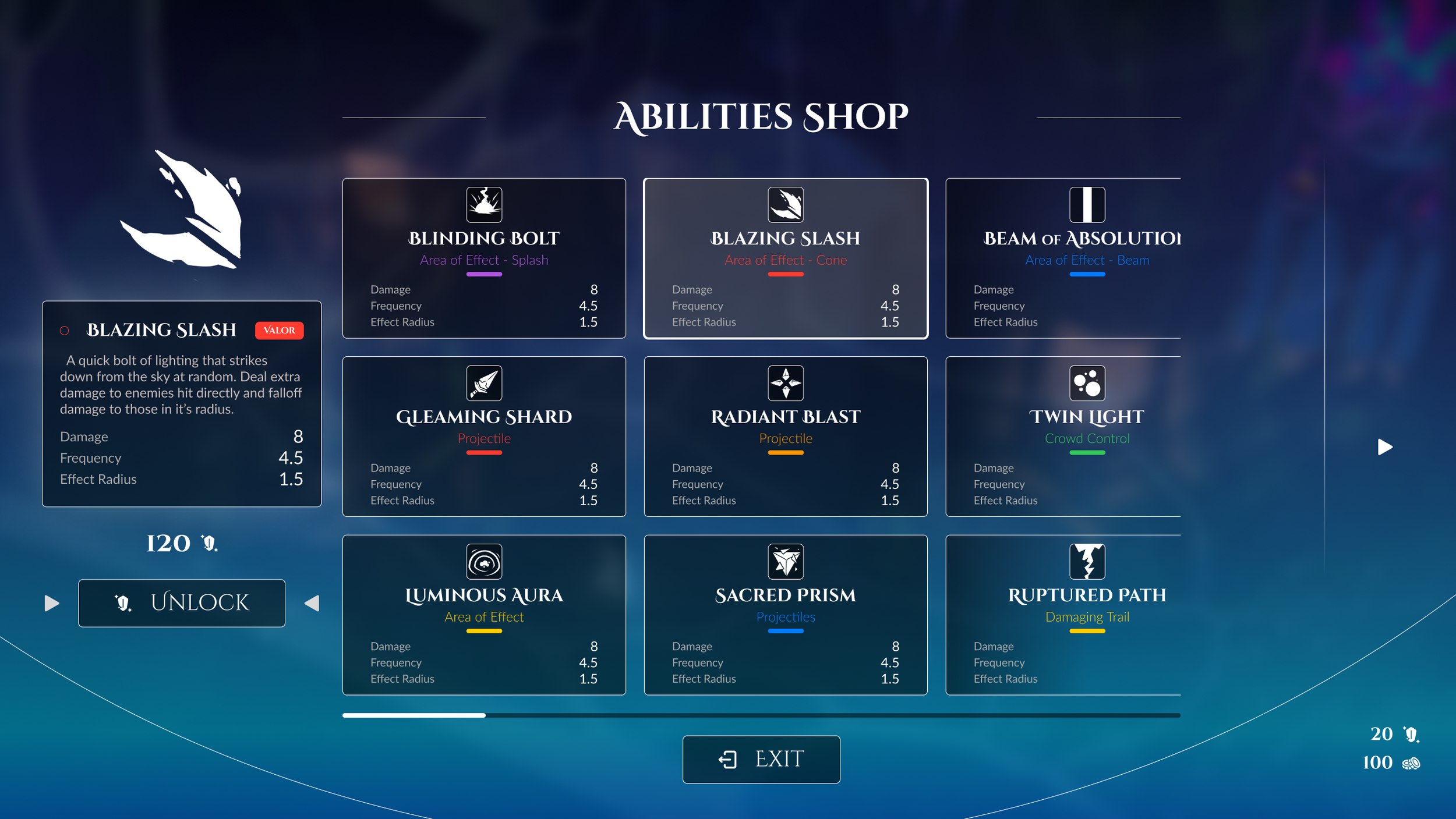
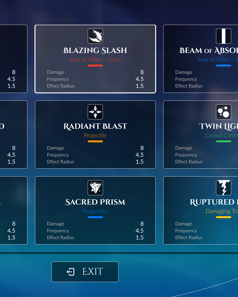
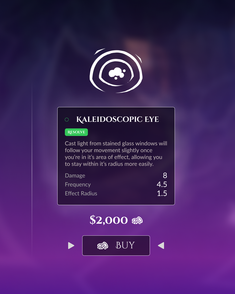
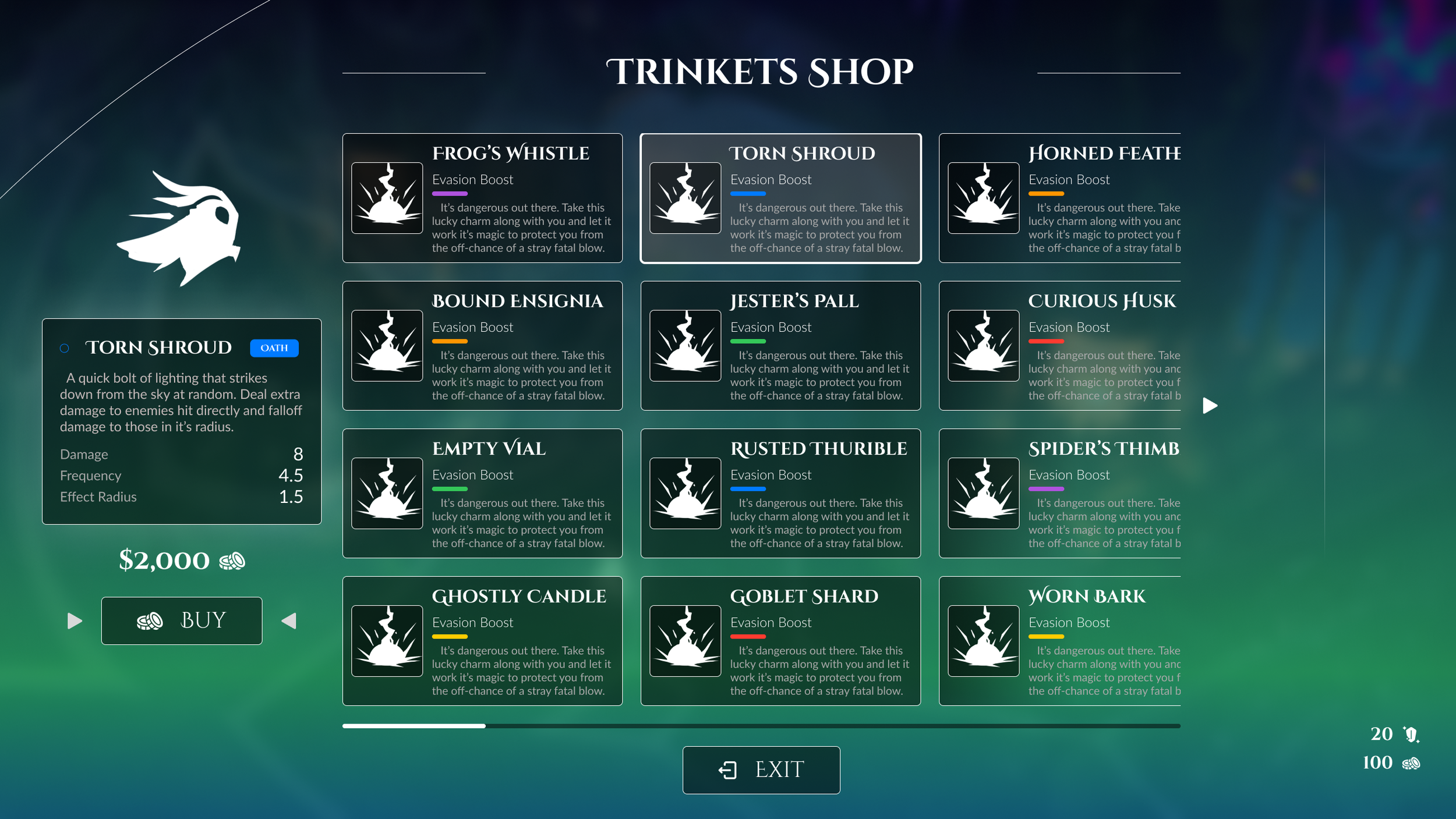
Shop Carousels
Every discrete object in the game - an ability, a trinket, an upgrade, a virtue node - shares the same base card structure: virtue color accent at the top, icon in a fixed position, name in Cinzel, description in a lighter weight below, stat delta in the bottom right. This single anatomy carries the entire item vocabulary of the game. Players learn it once on the level-up screen and read it instantly everywhere else. The consistency is invisible when it's working and immediately disorienting when it's violated — which is how you know the system is real.
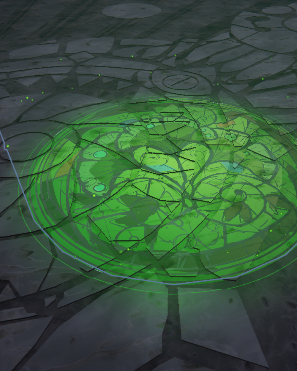
Each virtue casts a unique decal texture projected onto world space - a pool of colored light that lands on the cathedral floor and player geometry, signaling an active stat or mechanic through color alone. These aren't screen overlays. They exist in the scene, subject to the same lighting and shadow as everything else. A Valor buff reads as cold blue on the stone beneath the player's feet. A Patience proc settles into gold at the edges of their silhouette. The design challenge was keeping these world-space projections continuous with the camera-space UI sitting on top of them. Both layers use the same virtue color tokens, and the camera-space elements avoid any treatment the decals can't echo — so the world and the interface feel like they're speaking the same language rather than competing for the same surface.
Virtue Cast Lights
The level-up screen presents three choices simultaneously, and the player needs to read all three before committing to one. Each card carries ability name, level, stat deltas, and virtue association — enough information that early versions felt cluttered before a choice was even made. Replacing virtue icons with a slim color tab at the top of each card removed the decoding step without losing the signal. Virtue reads by color first, text second. The layout is center-aligned for the same reason: in a bullet-heaven, the player's focus lives at the center of the viewport, and a screen that pulls the eye sideways adds reorientation time before play resumes. Everything consolidates to where the player is already looking so the decision happens and the world comes back.
Quick Select Level-Up
04 Design Principles
The central tension of Lighteater's visual design is the same as its mechanical tension: the world is trying to kill you and the world is beautiful. Every design decision had to serve that duality - an interface that ignores the atmosphere fails the game, and one that drowns in it fails the player.
Stained Glass
Virtue colors are drawn directly from the in-game stained glass palette and function as tokens throughout the interface. Navigation, sidebars, and chrome use near-neutral surfaces so the virtue colors carry all the chromatic weight. A player in the Valor tree lives in cool blue. A player in the Grace tree lives in warm amber. The color does identity work across every screen without a single additional label.
Modern-Archaic
Most game UI is designed for flat space. Lighteater's primary surface is depth, atmosphere, and moving light. Interface elements that overlay a world rendered in candlelight and shadow have to reckon with this: a card legible on a dark stone background becomes illegible when light from a stained glass window passes behind it. The design response was a consistent inner shadow treatment on all cards and a minimum contrast floor enforced by the token system.
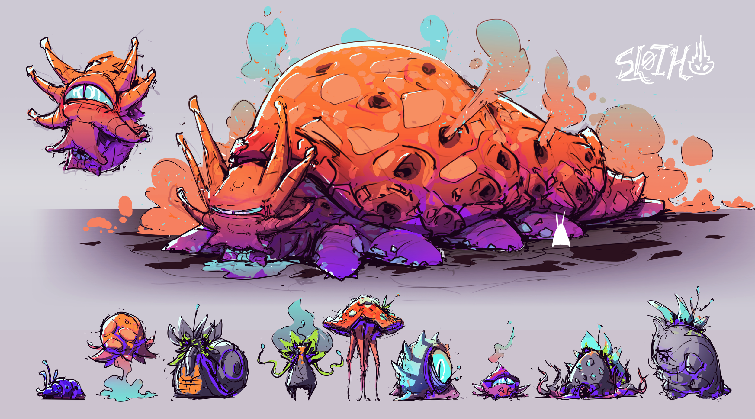
(Illustrations done by me)
World Color Integration
The UI palette was pulled directly from the enemy and environment concept art - the same saturated hues that define the game's creatures, biomes, and boss designs. Rather than inventing a separate color language for the interface, the stained glass elements of the UI echo those existing vibrant tones, so the screens feel like they were lit by the same world the player is navigating. A color that appears on a boss reads with the same weight when it appears on a card header. The interface inherits meaning from the art rather than having to build it independently.
Illustrating the Mockup
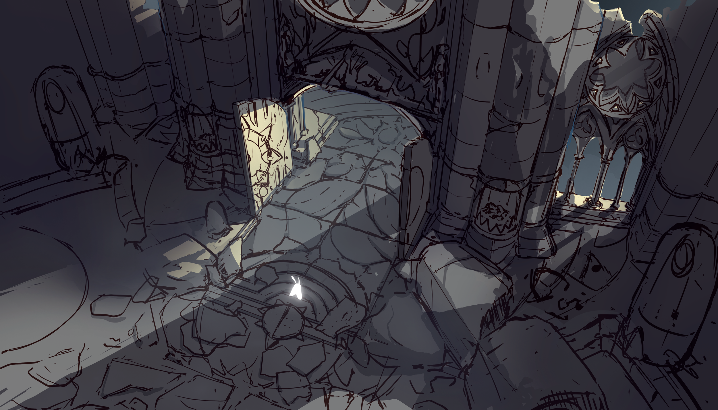
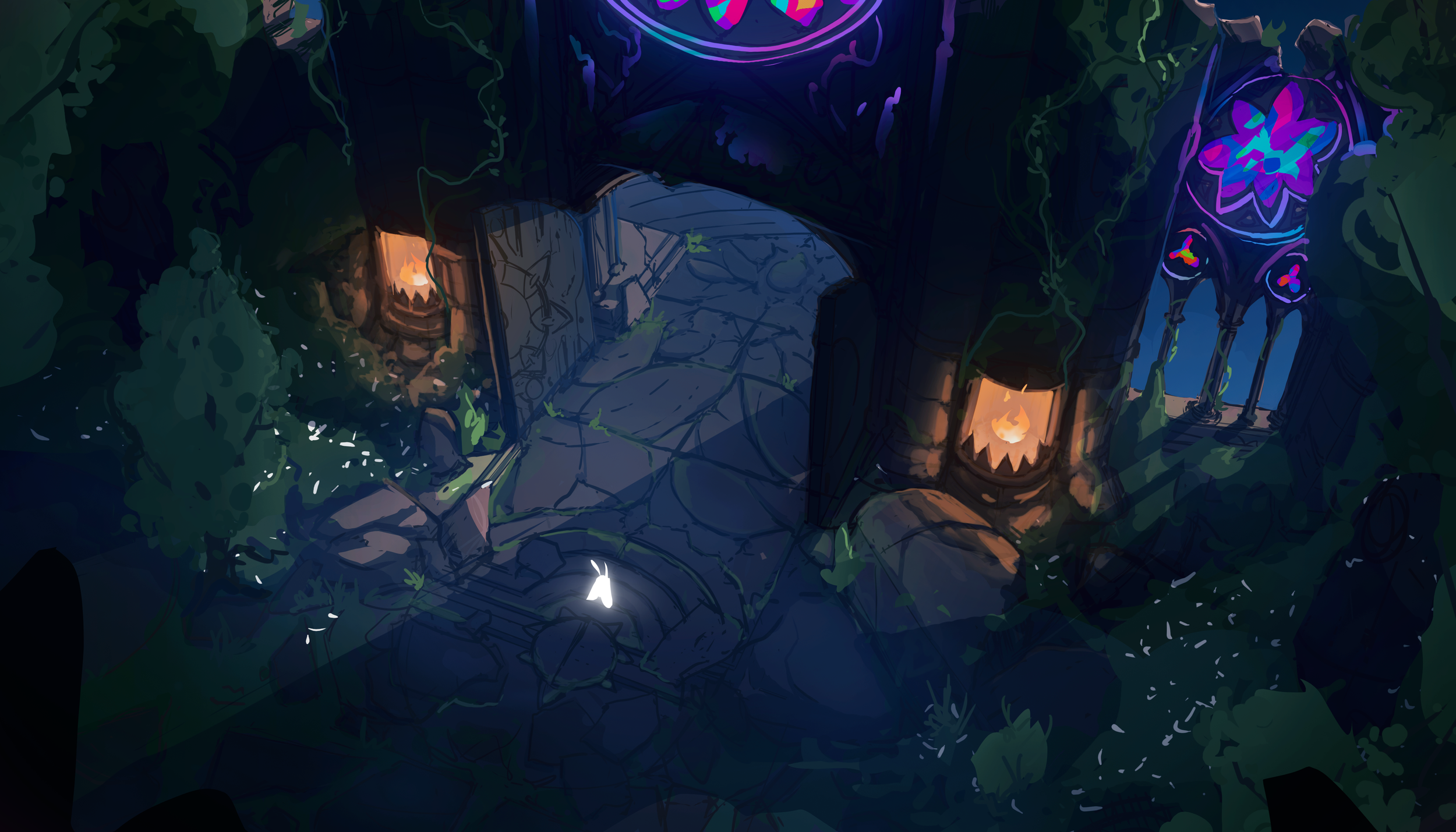
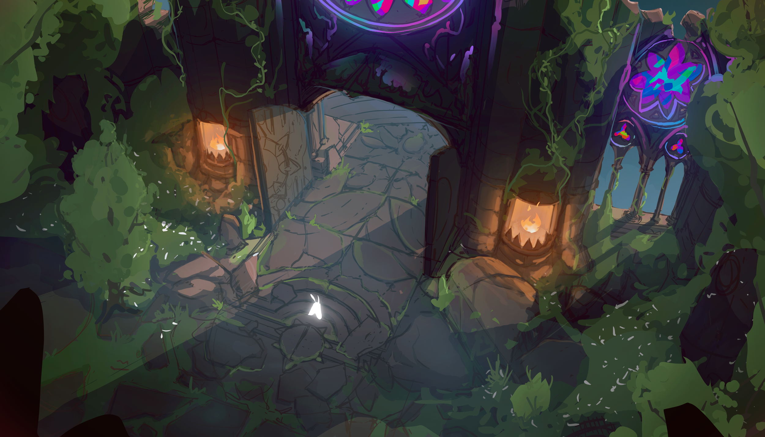
Before any UI screen could be designed in context, the game needed something to design against. Rather than waiting on final environment art, the mockup foundation was illustrated from scratch - concept paintings of the cathedral interior, the forest floor, and the combat space, drawn on a professional illustration background built across years of concept and game art work. That foundation made every UI decision more specific: color, atmosphere, and spatial logic were present from the start rather than assumed. The same skill set extended to assets throughout the system. The virtue icons were designed and drawn as original pieces, carrying the visual register of the game's world rather than arriving as generic library sourcing. For cross-collaboration with the engineer, illustrated references communicated material and intent faster than written specs or wireframes alone - which kept the feedback loop short across the entire build.
05 Screens
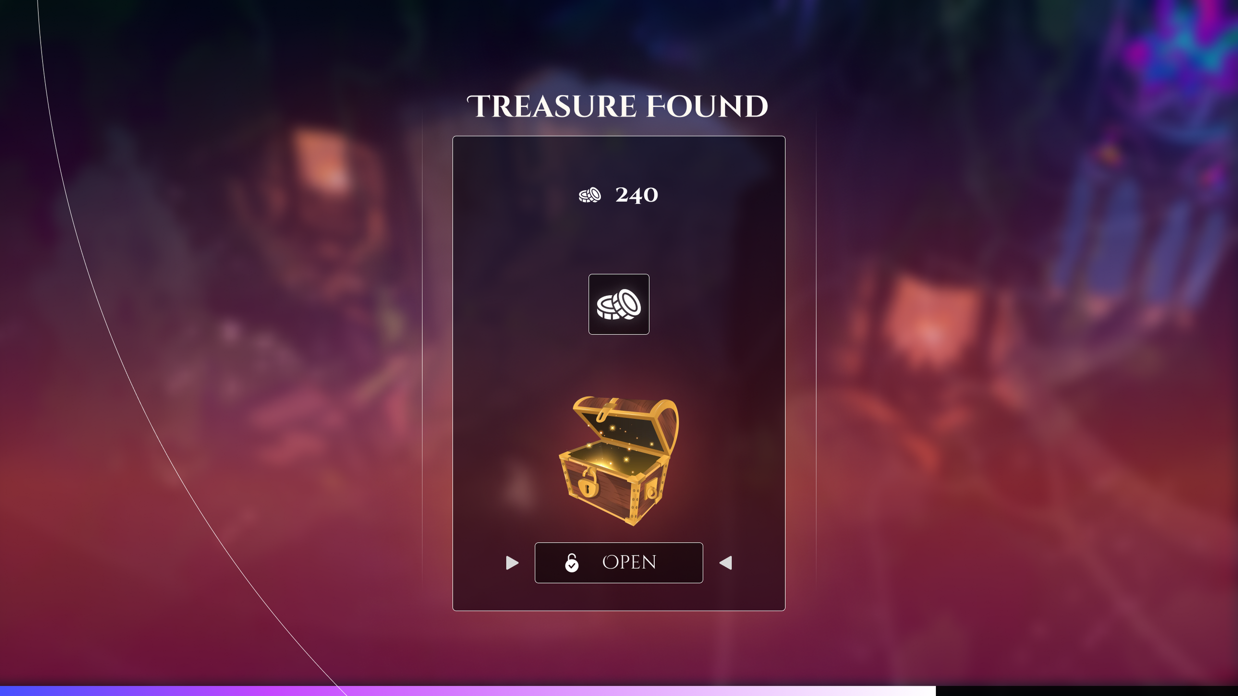
The screens below cover the full range of player states: active combat, mid-run decision, post-run progression, and the shop. Each one is a different design problem with the same constraint - it has to feel like it was made by the same world that made the cathedral.
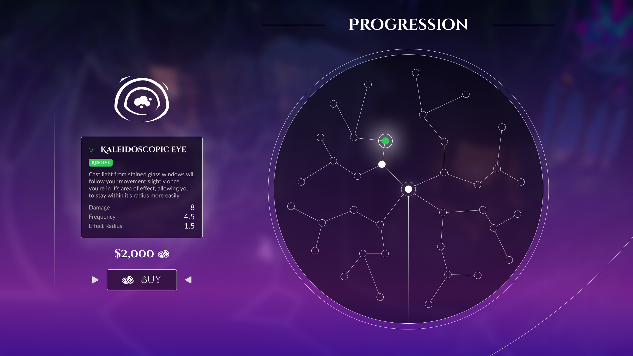
Implementation
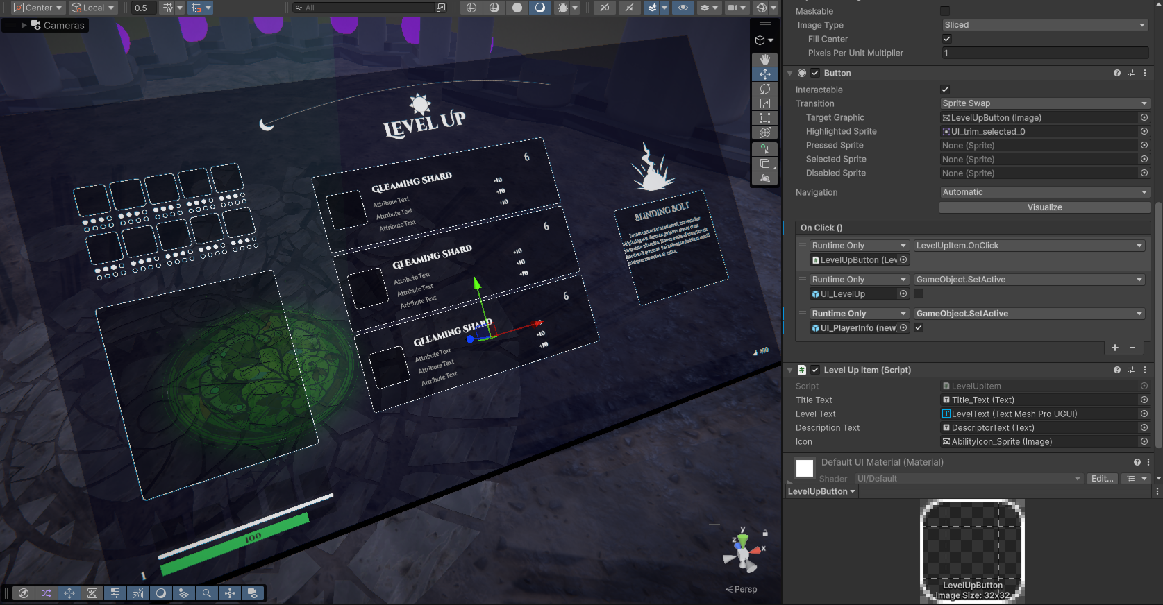
The design was built to hand off cleanly to a live Unity 6 build. Every component - the card anatomy, the virtue color tokens, the HUD state logic - was specced with implementation in mind from the first pass. Working directly alongside the engineer during the layout phase meant that constraints surfaced early, when they were still design problems rather than production problems. The level-up screen, the shop carousel, and the HUD all ship as prefab components with token-driven styling rather than per-screen overrides.
Unity 6 Editor
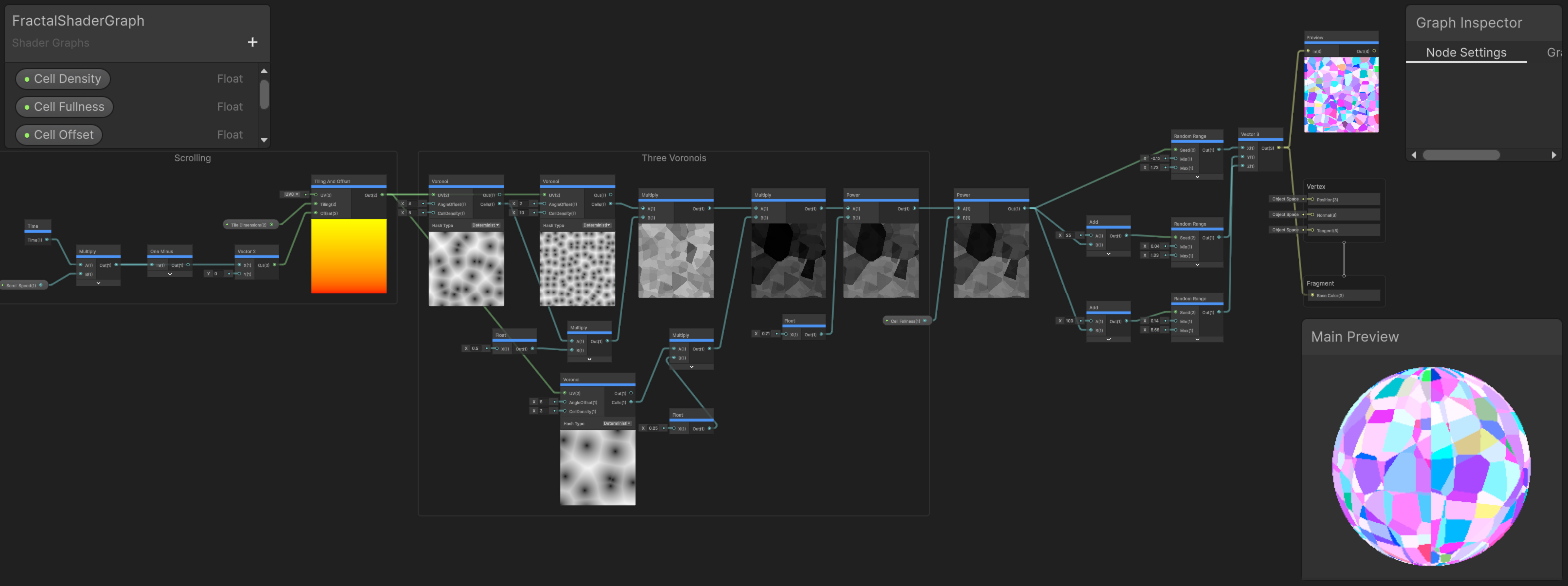
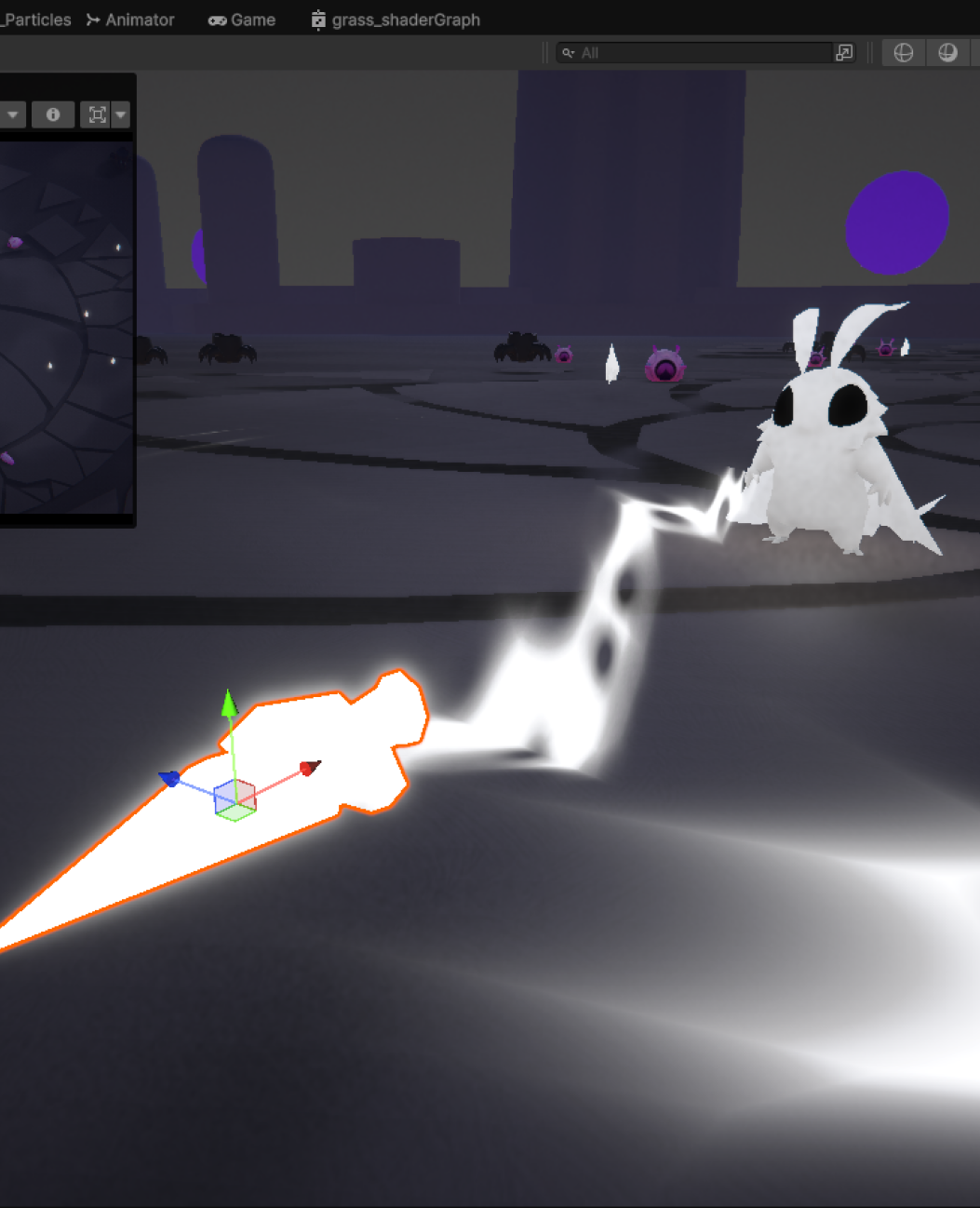
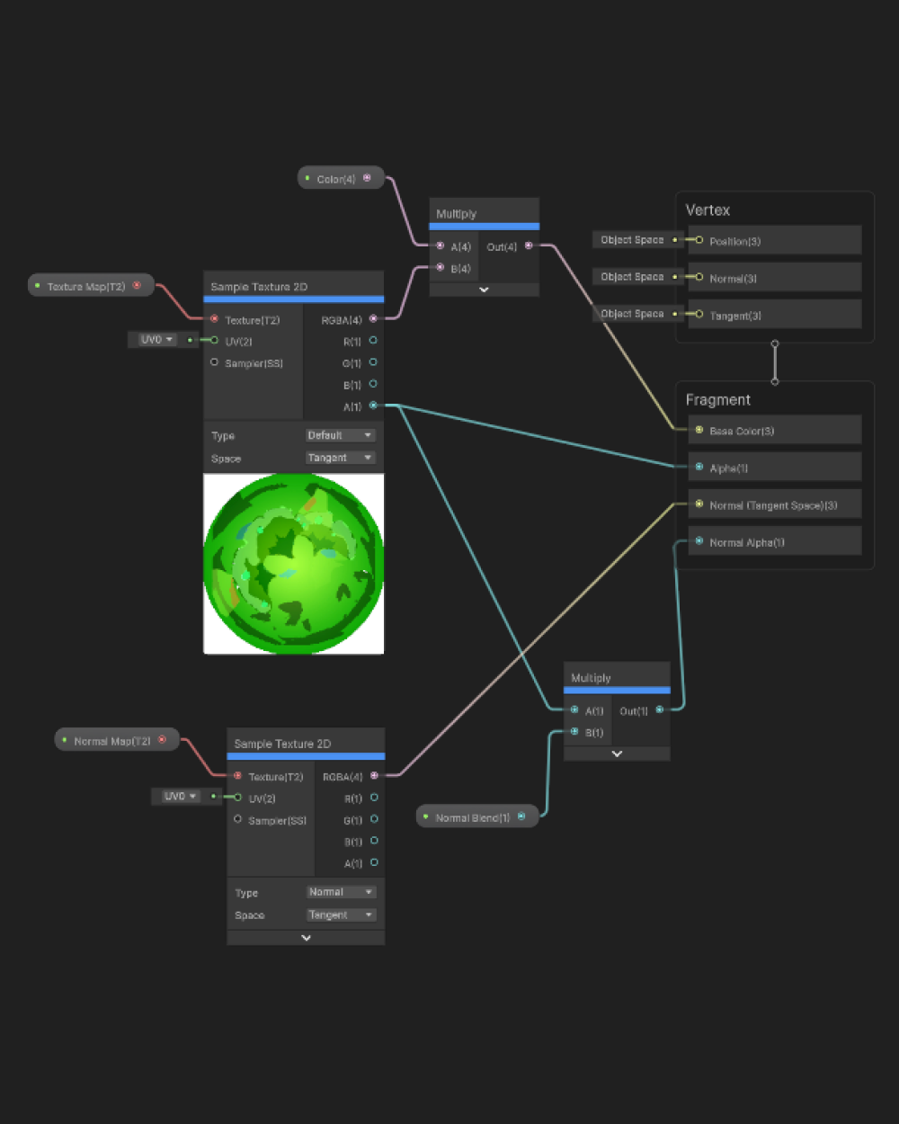
The fractal light effect on the XP bar and select UI elements was built directly in Unity Shader Graph rather than approximated through static textures or animator workarounds. The effect needed to feel alive and responsive to player state, and a node-based shader was the only way to achieve that with the control and performance the live build required. Working fluently in node-based systems like Shader Graph sits at the intersection of design and implementation - it means complex visual ideas don't have to stop at the mockup stage and wait for an engineer to interpret them.
Unity Shader Graph
05 Reflections
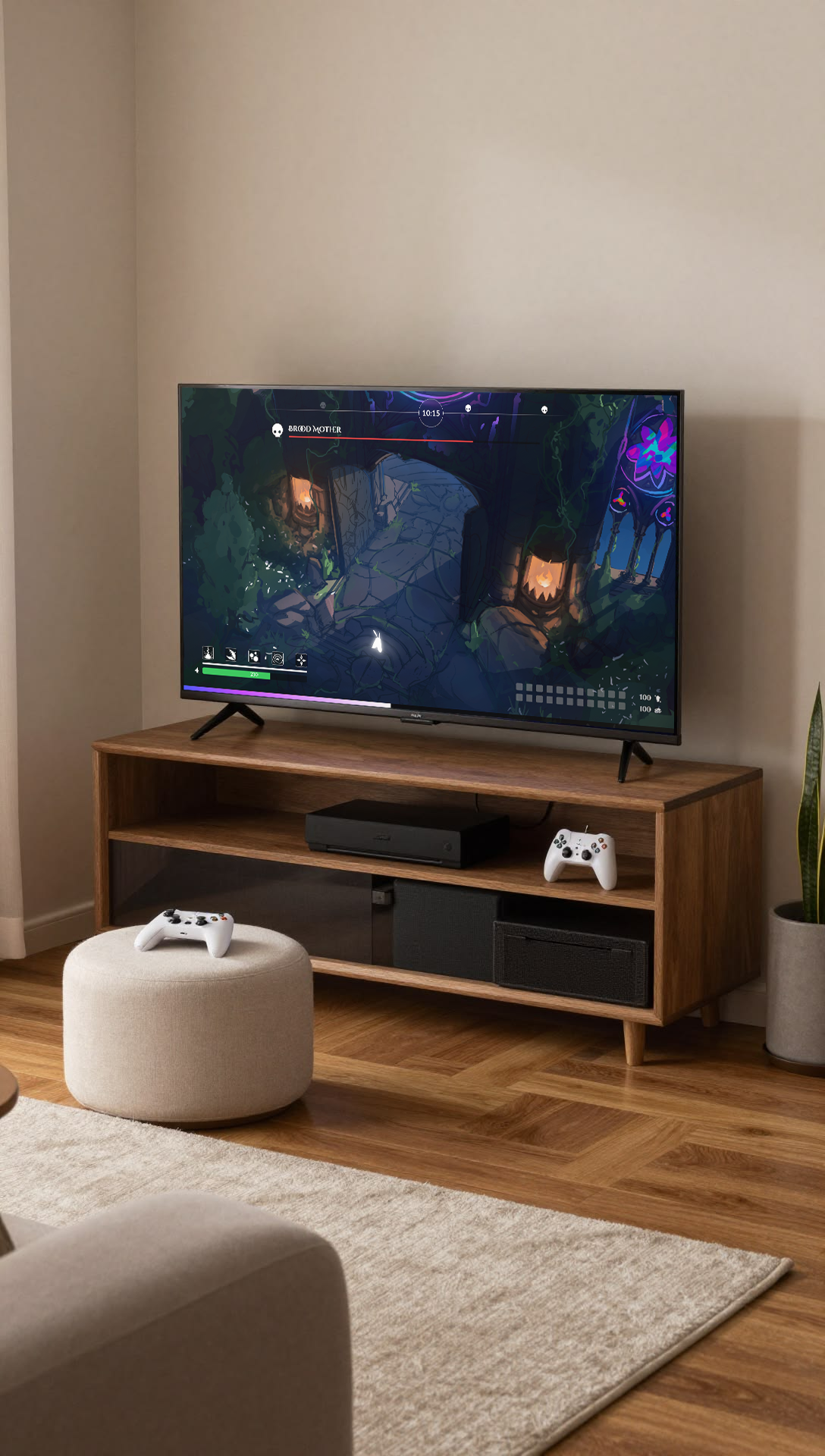
On designing for a moving target
Lighteater's mechanics were still being discovered during the design phase. Abilities changed, virtue relationships shifted, and systems that seemed settled one week were reconsidered the next. Designing a UI system against a game that isn't finished yet means building for flexibility rather than finality - components that can absorb new object types without breaking, color tokens that can be reassigned without rebuilding screens, layouts that don't depend on a specific number of choices being correct. The instinct to lock things down early has to be resisted. A UI that's optimized for the game as it exists today can become a constraint on the game as it needs to become tomorrow.
On designing UX alongside a game designer
Working with someone who is simultaneously designing the game's systems and building them in Unity creates a boundary problem that doesn't exist on more separated teams. Decisions about how something feels to play and decisions about how it looks and reads are not cleanly separable, which means the line between disciplines gets crossed constantly in both directions. The most productive moments came from treating that overlap as a feature rather than a source of friction - being willing to follow a design decision into implementation, and being open to a mechanical change reshaping a screen that felt finished. The pitfall is assuming the boundary is fixed. It isn't, and the work goes better when nobody pretends it is.
On designing for an uncertain platform
It was never fully resolved whether Lighteater would ship on PC, mobile, console, or an emerging platform like Netflix Games or Apple Arcade. Each of those contexts imposes different input models, screen sizes, session lengths, and audience expectations. A HUD designed for a mouse and keyboard reads differently on a touchscreen. A level-up screen that works at 1080p may need to be reconsidered at 390 pixels wide. Designing without a confirmed platform meant holding those variables open rather than optimizing for any one of them - which produced a more considered system but also one that will require targeted adaptation when the platform decision lands.